Ascando Partners
When Soom Consulting became Ascando Partners, we built a calm, credible brand with identity, digital brand manual, presentation template and a Webflow website, ready for launch in six weeks.
New name, new identity and website for a Nordic consulting firm
The task
Ascando Partners is a Nordic consulting firm based in Oslo that helps leadership teams close the gap between strategy and execution. The company was originally named Soom Consulting, and partners Helge Ratvik, Olav Hestmann and Axel Wollan planned to launch the new name in January 2026. They needed a complete brand that signals experience, calm and precision, without looking like the big consulting houses. Everything had to be ready for launch: logo, identity, presentation template, website and LinkedIn material.
The solution
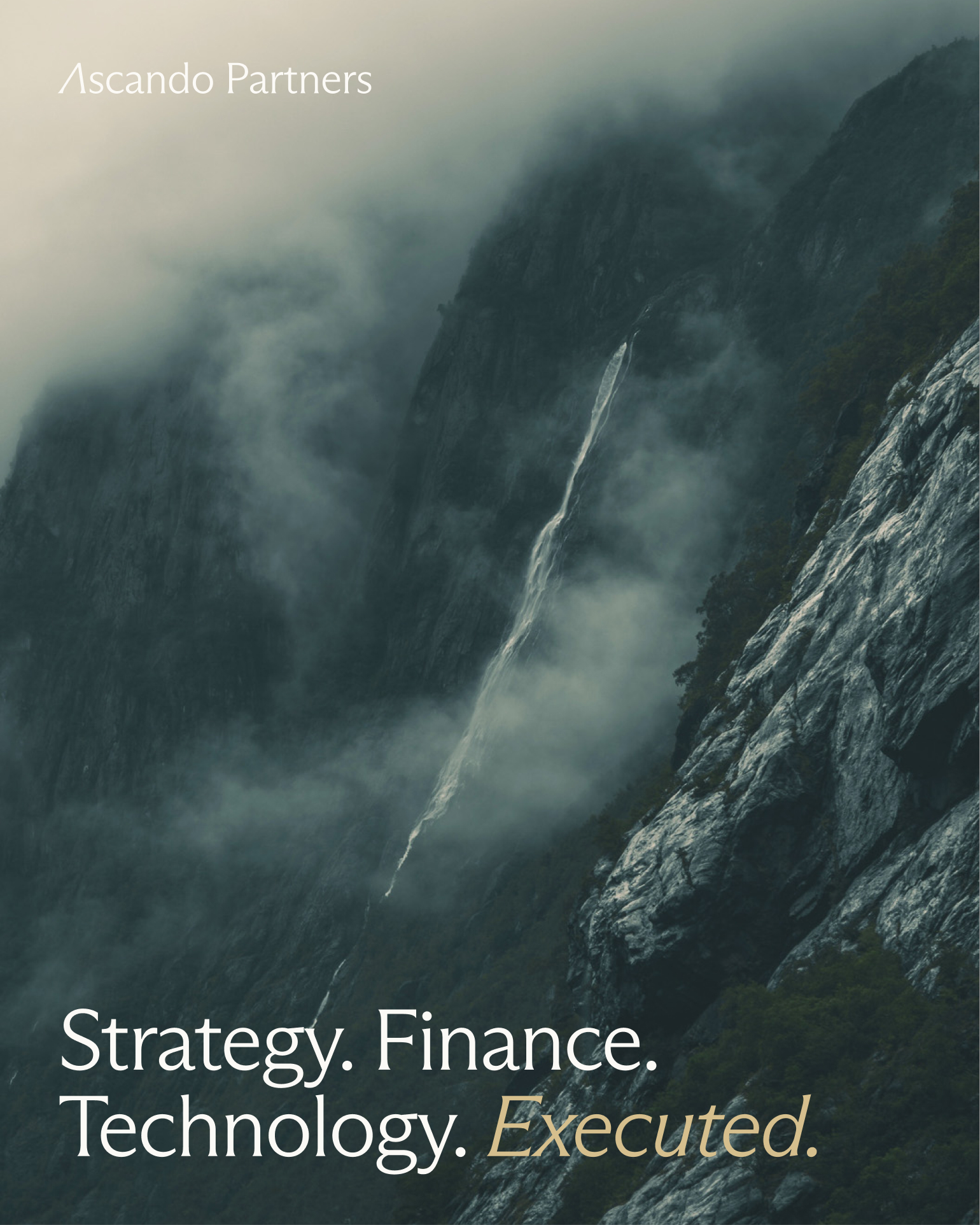
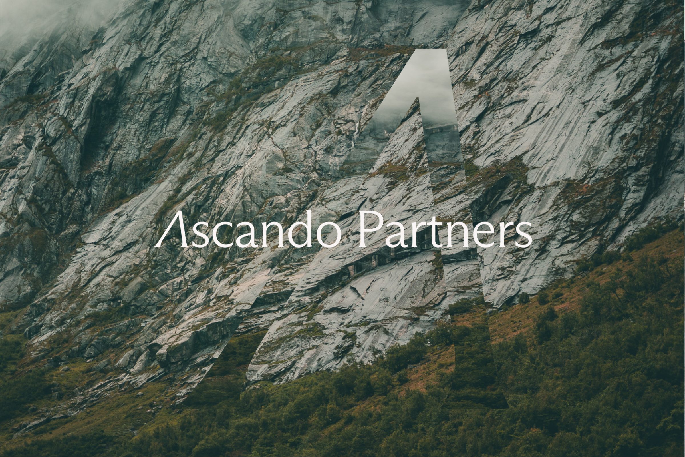
We started from the direction already set together with Blyant: an earthy palette inspired by Norwegian nature. From there we developed logo directions, refined the colour palette and landed on a brand mark where A and P meet in a rising line. The symbol points to the name, Ascando, and to what the company actually does: making its clients' ascent real.
- Logo with primary and secondary versions, in dark, light, sand and brown variants
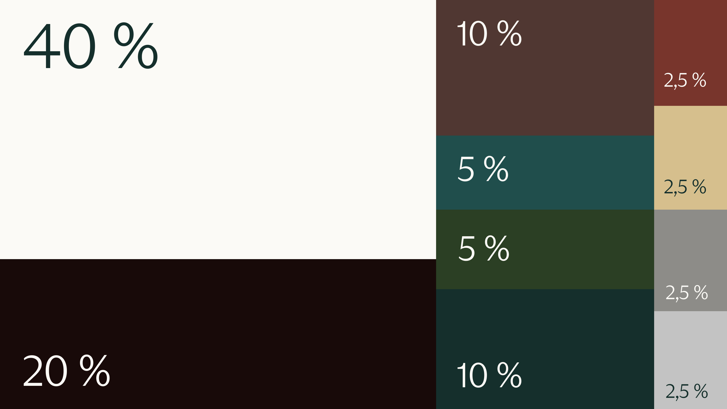
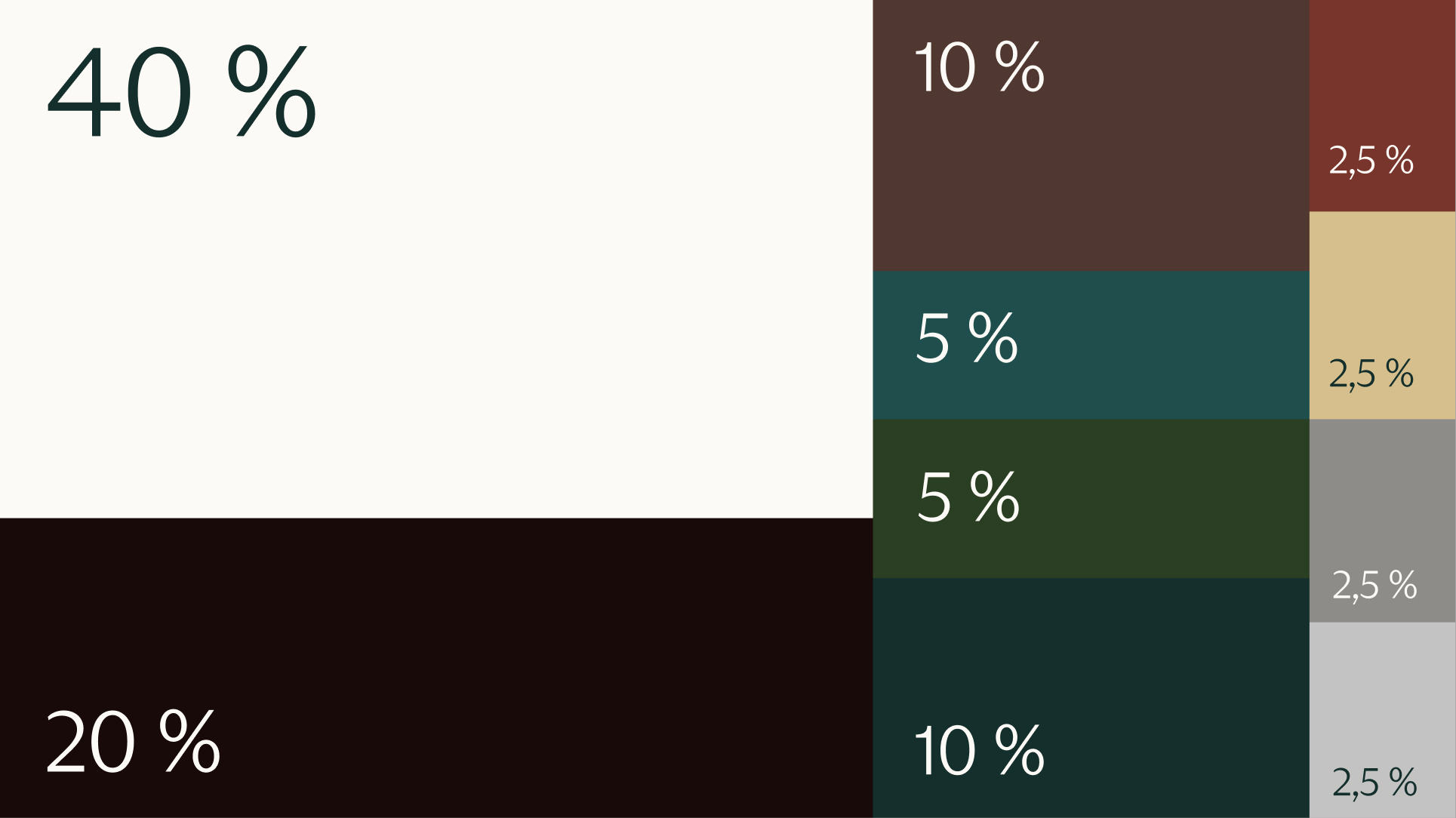
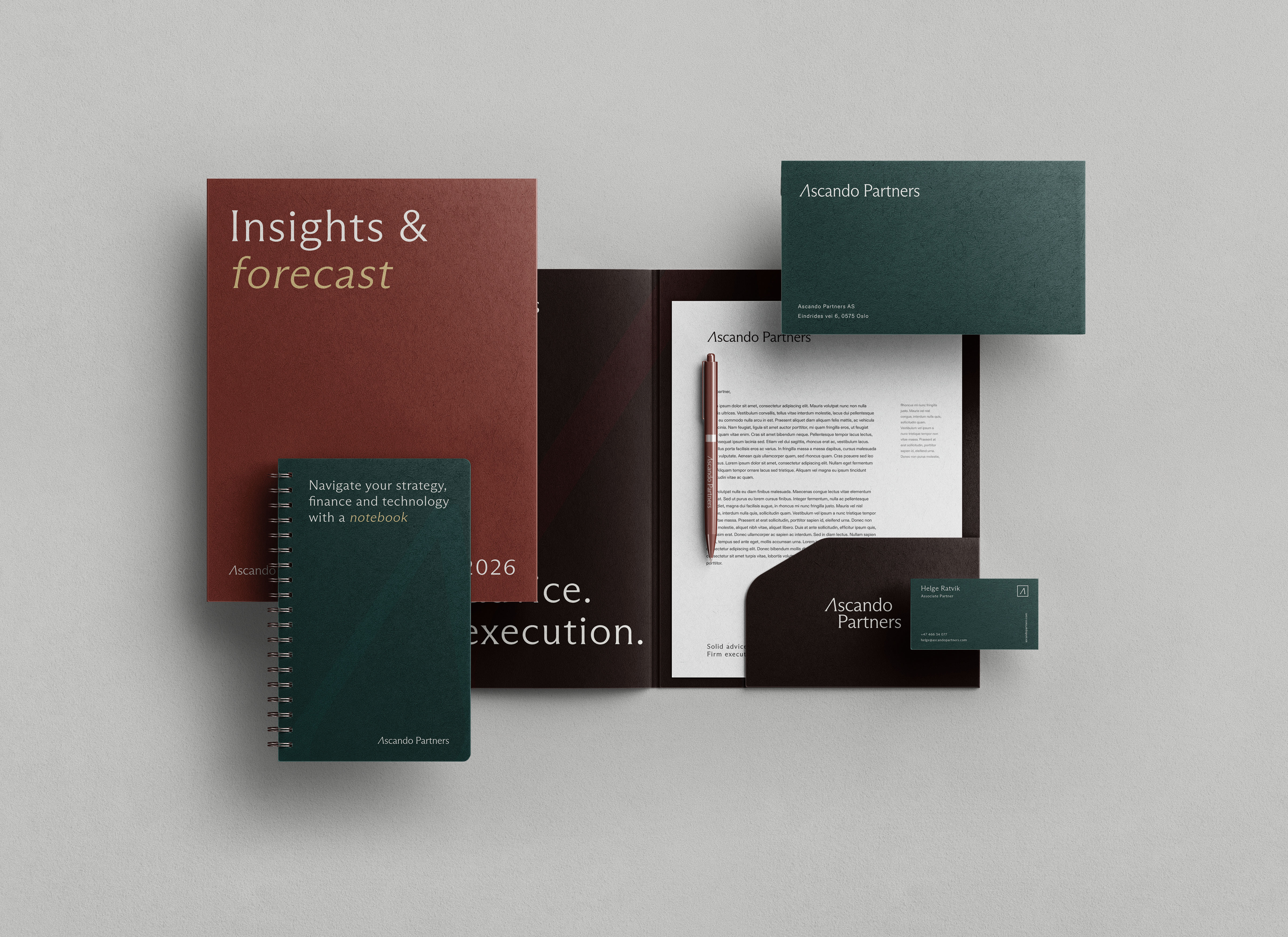
- Colour palette with Ascando White, Dark, Dark Green and Sand as primary colours, and a secondary palette in brown, moss, steel and midnight blue
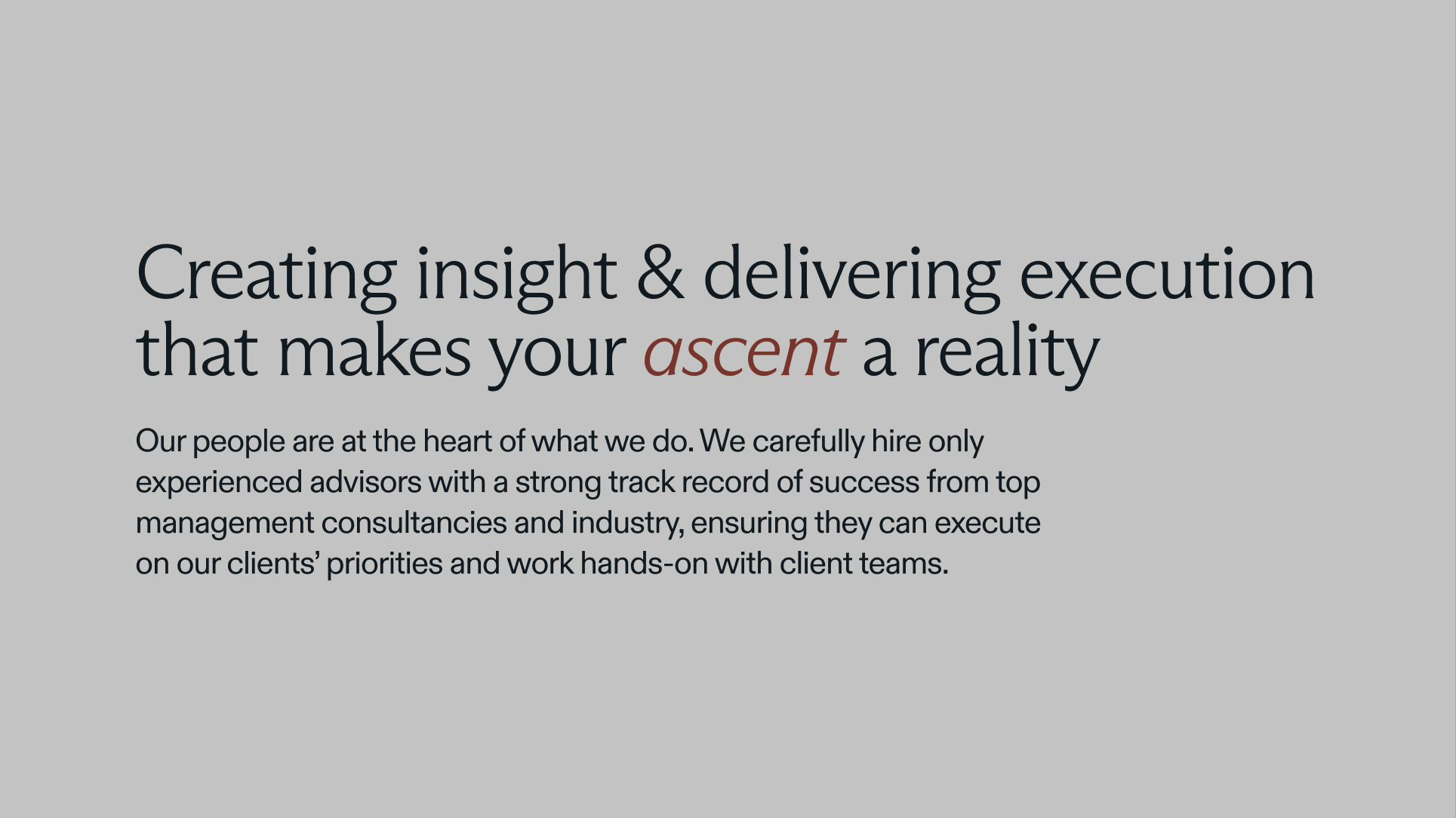
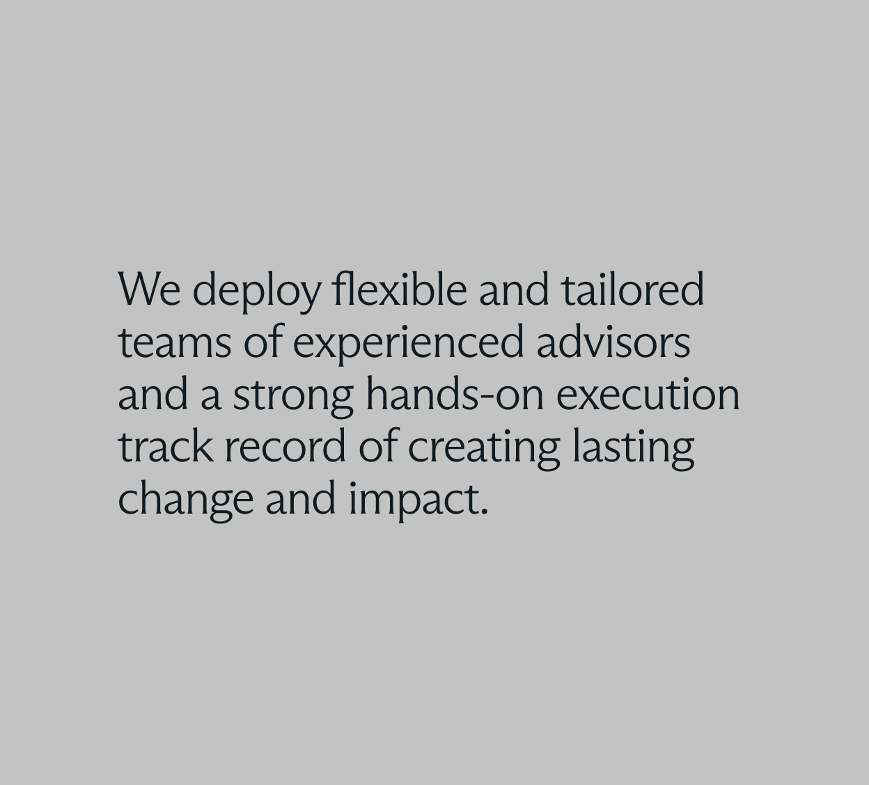
- Typography with Arizona Flare for headings and Diatype for body text
- Tone of voice and rules for text on images, hierarchy and alignment
- Digital brand manual published as part of the website, so the whole team always has the latest version
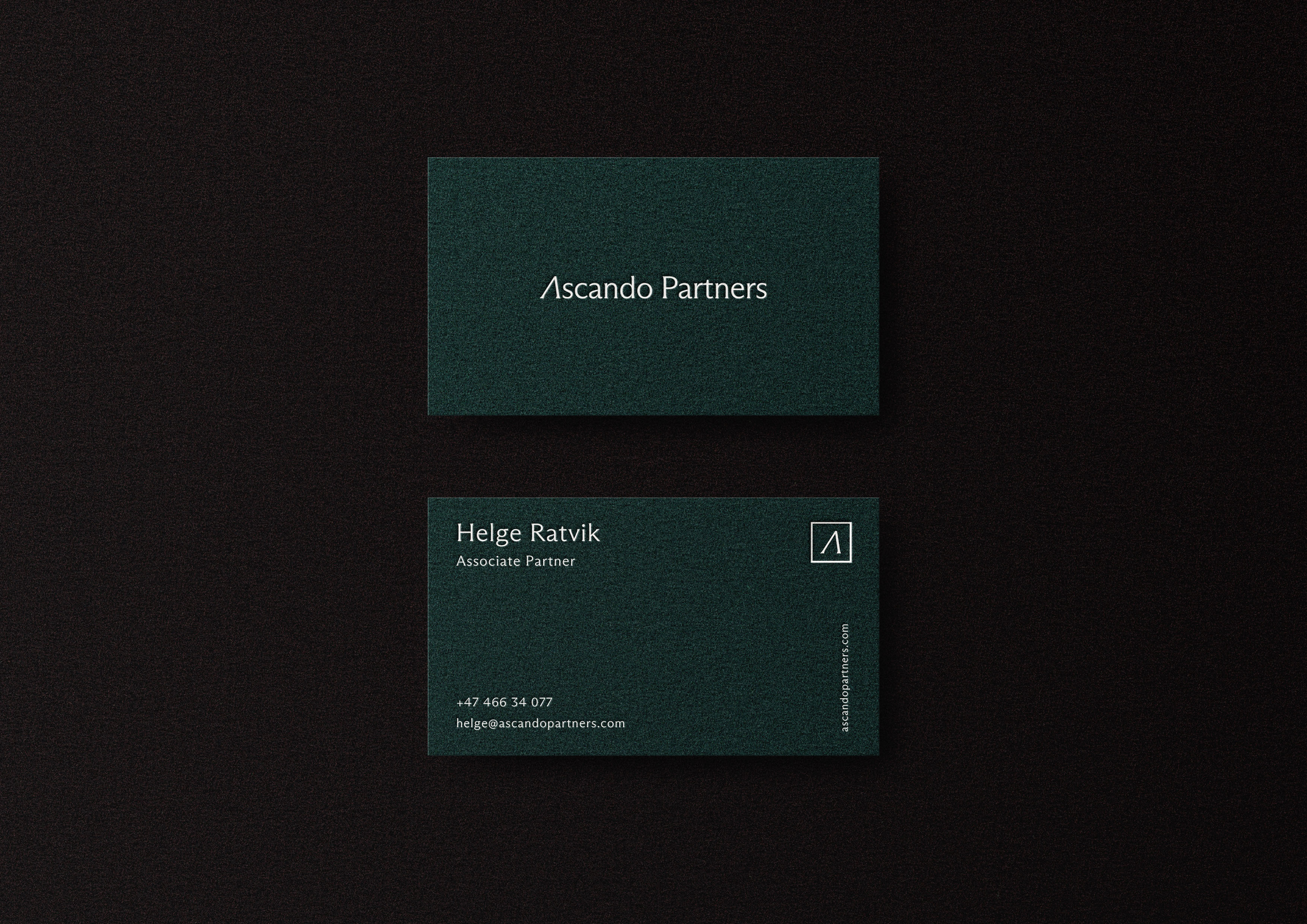
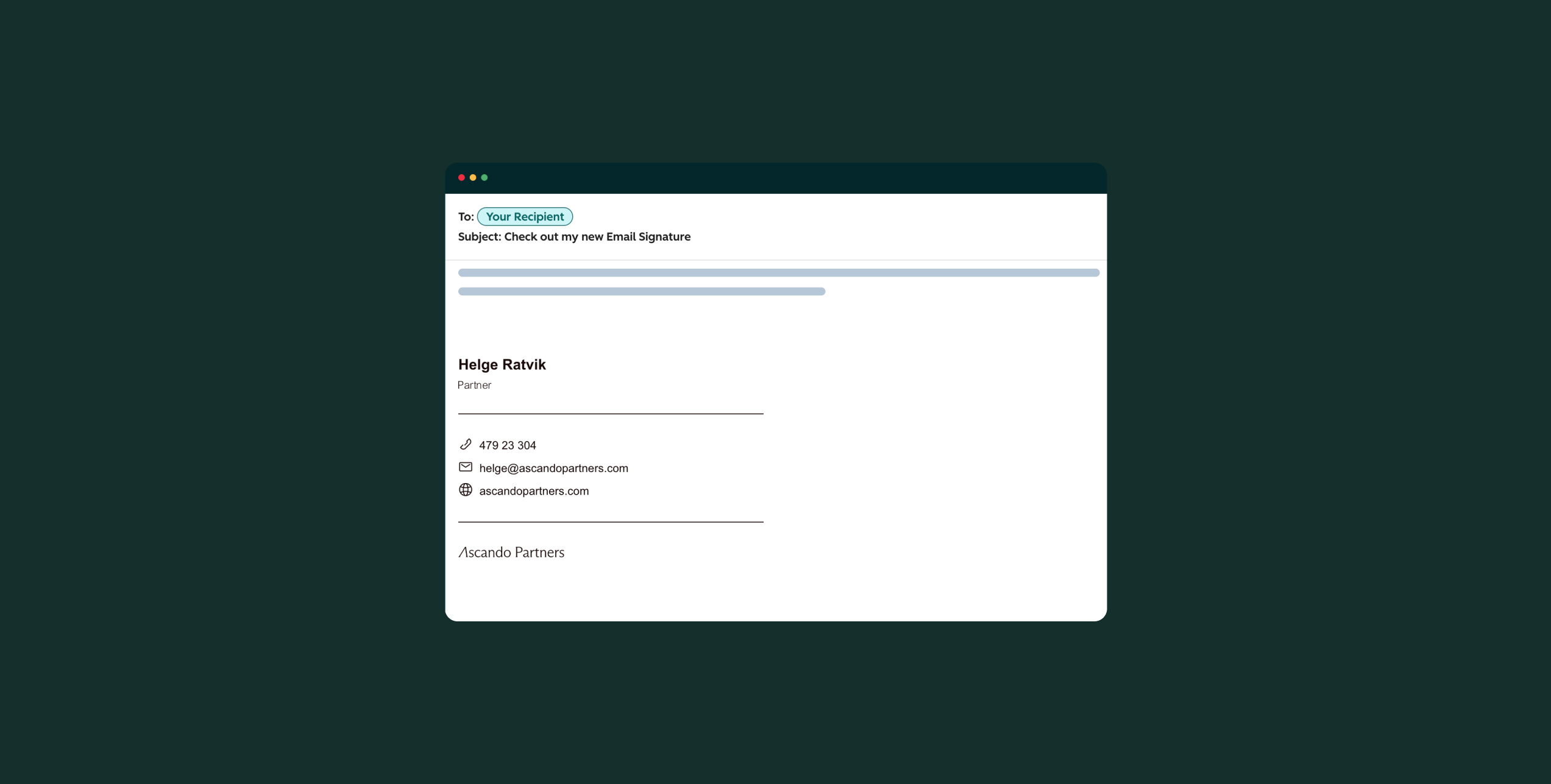
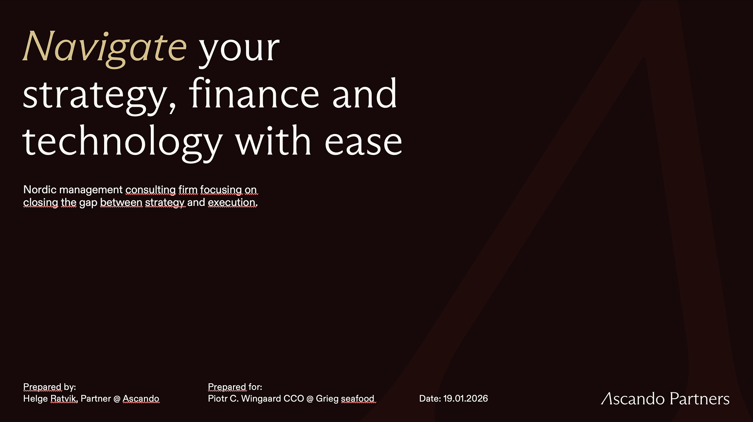
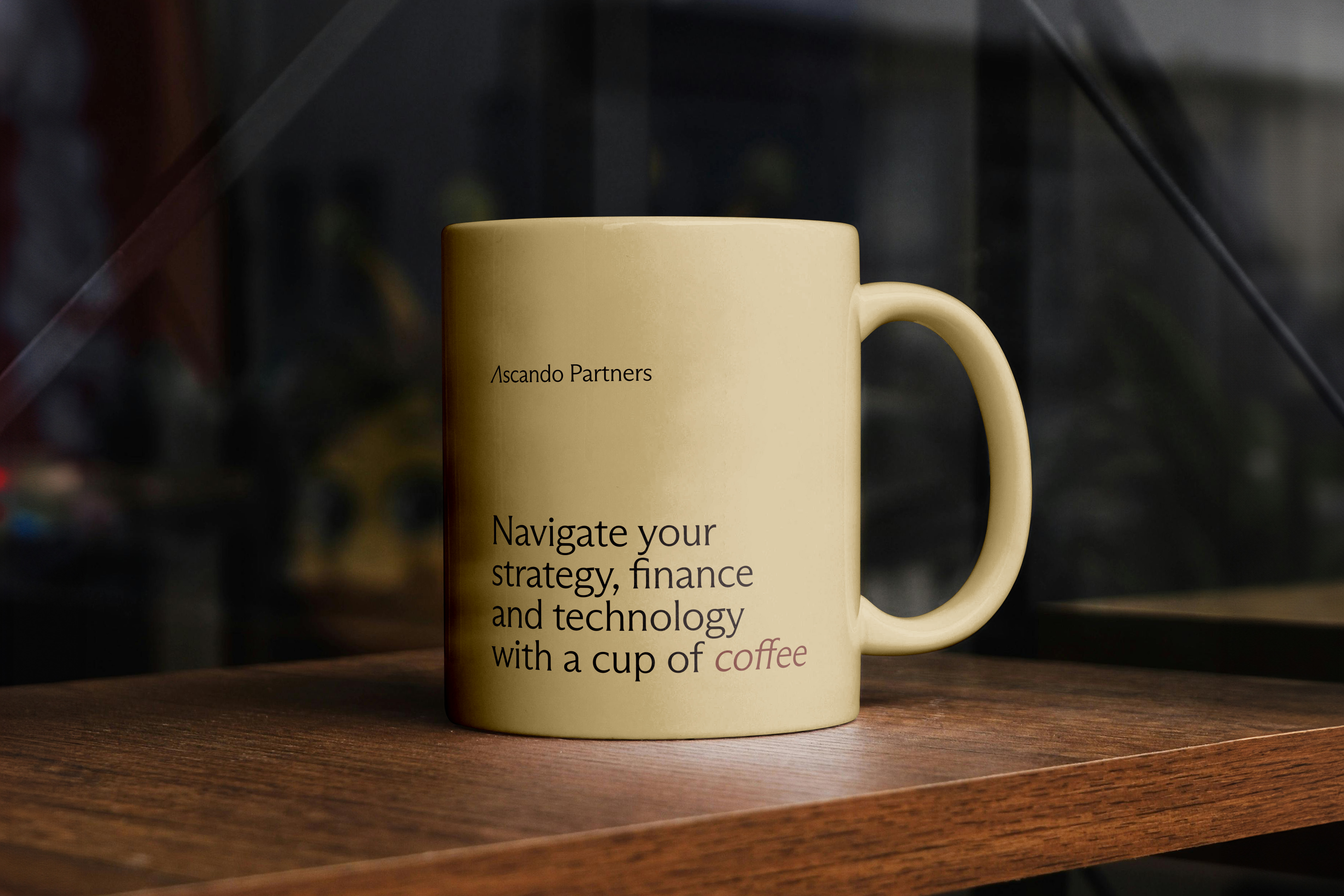
- PowerPoint template, business cards, email signature and LinkedIn banners
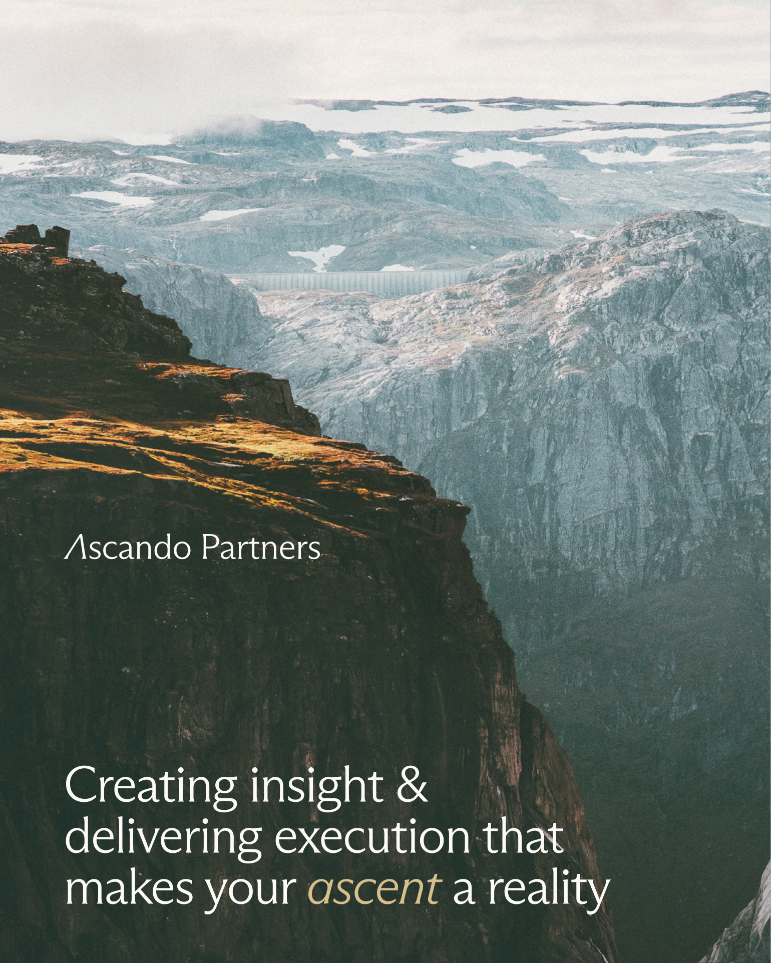
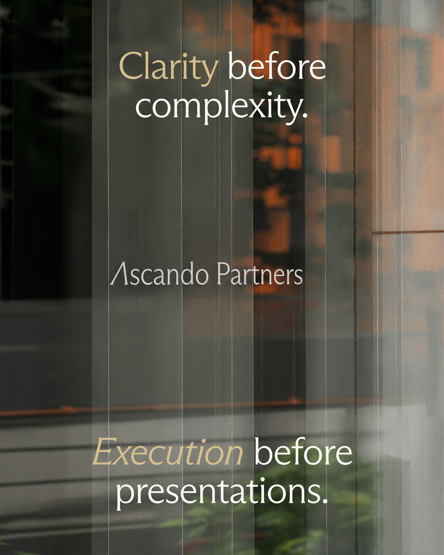
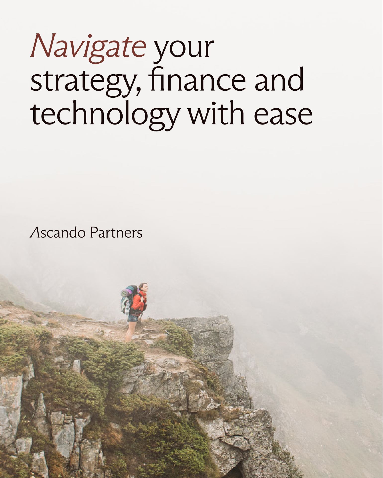
- LinkedIn launch carousel introducing the new name
The website
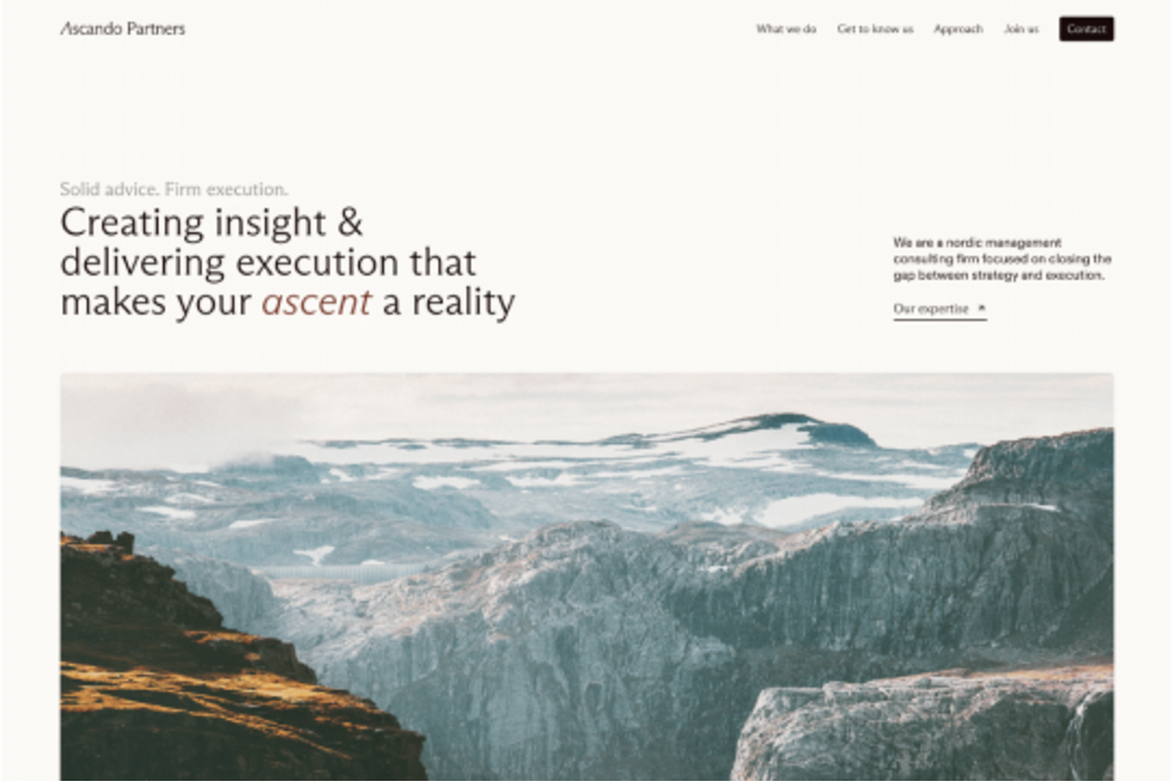
The website is built in Webflow with a simple structure: what they do, how they work, who they are and how to get in touch. We used generous white space, large nature photography and short copy so the message of experienced advisers with documented results comes through clearly. The site is built mobile first, with optimised images and no heavy plugins. The partners edit text and content themselves in Webflow, and the brand manual lives on the same domain under /identitet.
Results
- From first logo sketch to published website and LinkedIn launch in under six weeks
- One unified visual system that works in presentations, on the web and in social media
- A brand manual that lives online and can be updated without new PDFs
- A team that can publish content and maintain the site on their own
"Thank you for a really nice website. This has turned out fantastic, and Simmer will always have a good reference from us at Ascando Partners." Helge Ratvik, Partner at Ascando Partners.
Deliverables
- Logo and visual identity
- Digital brand manual
- Presentation design
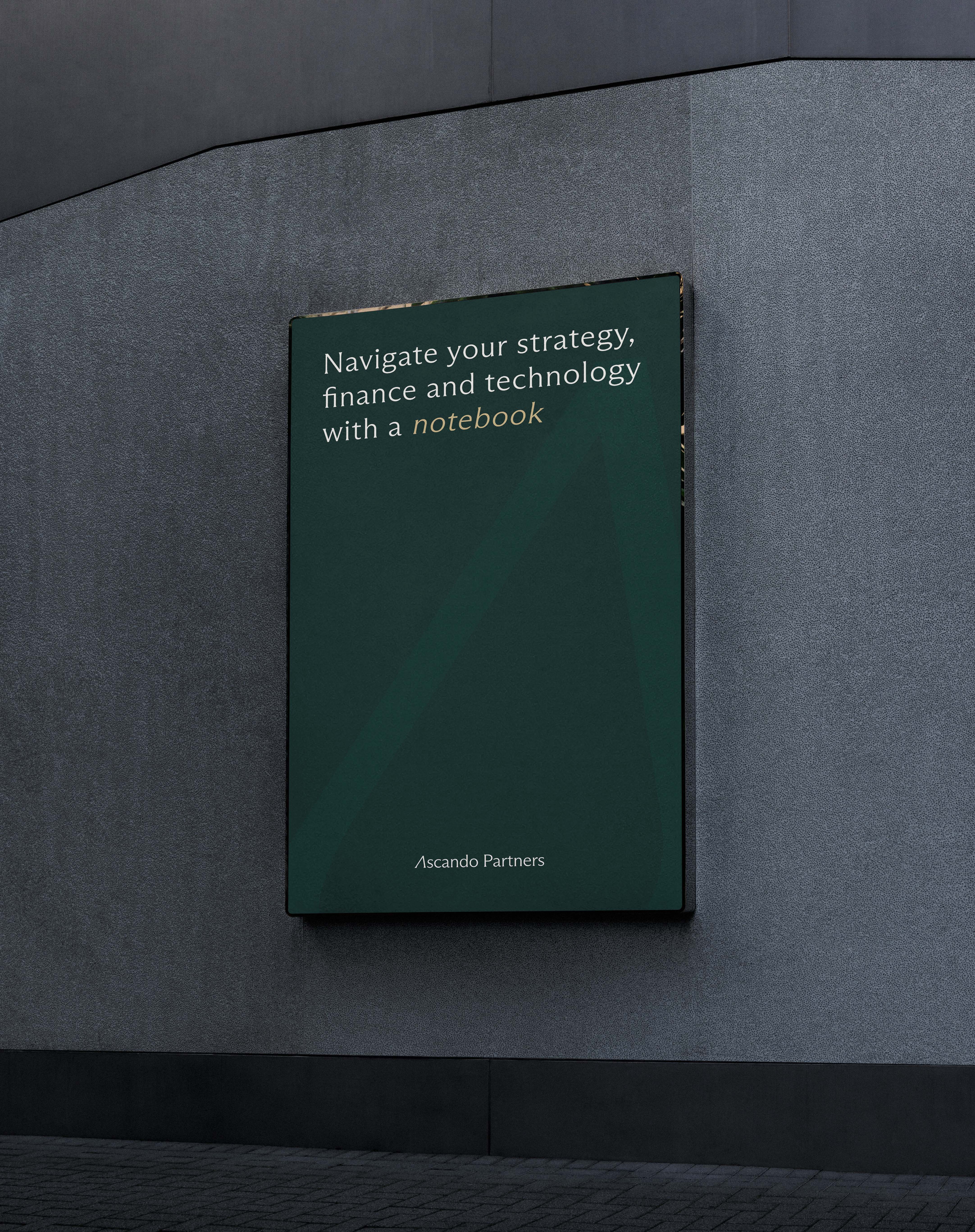
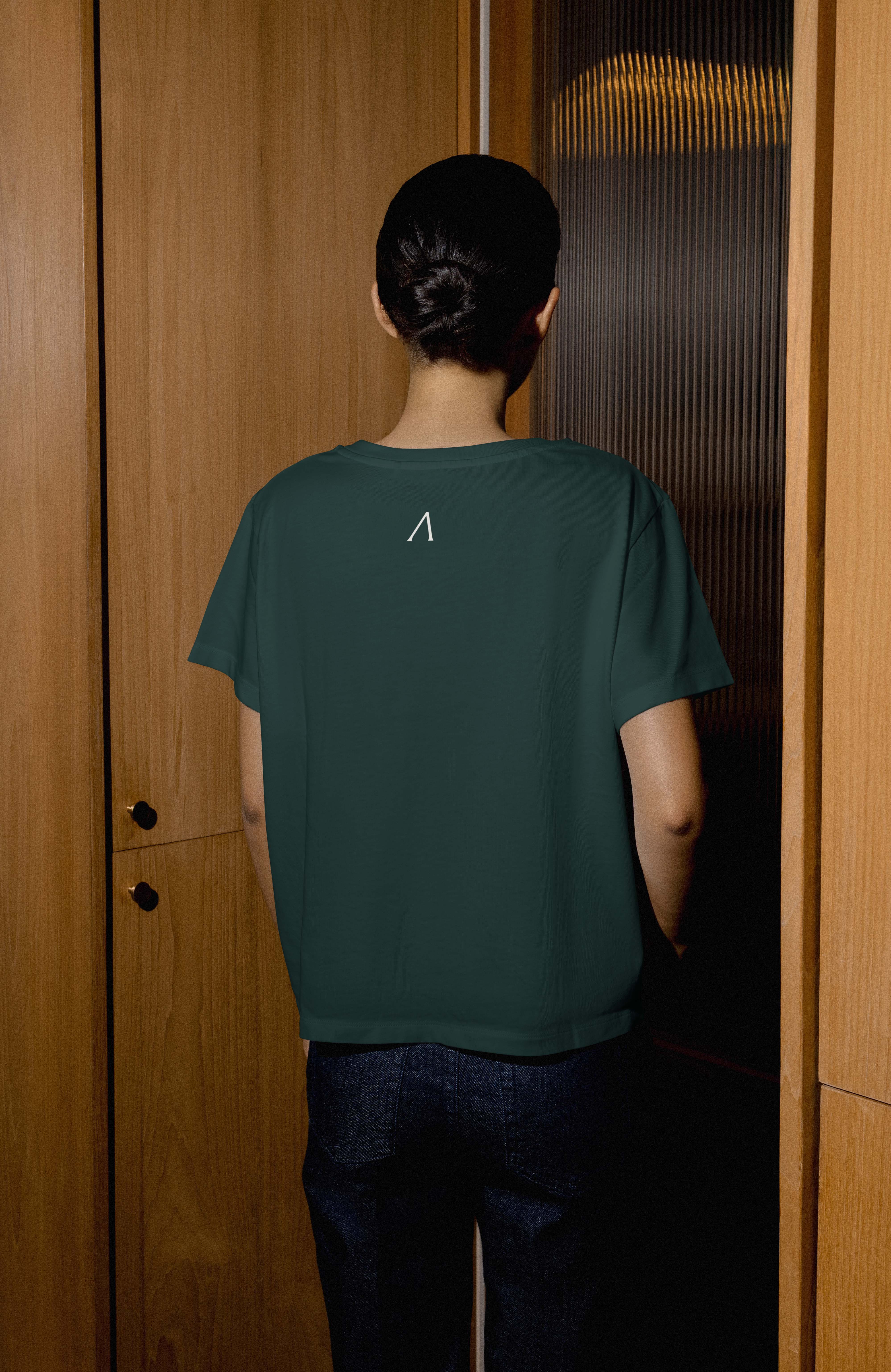
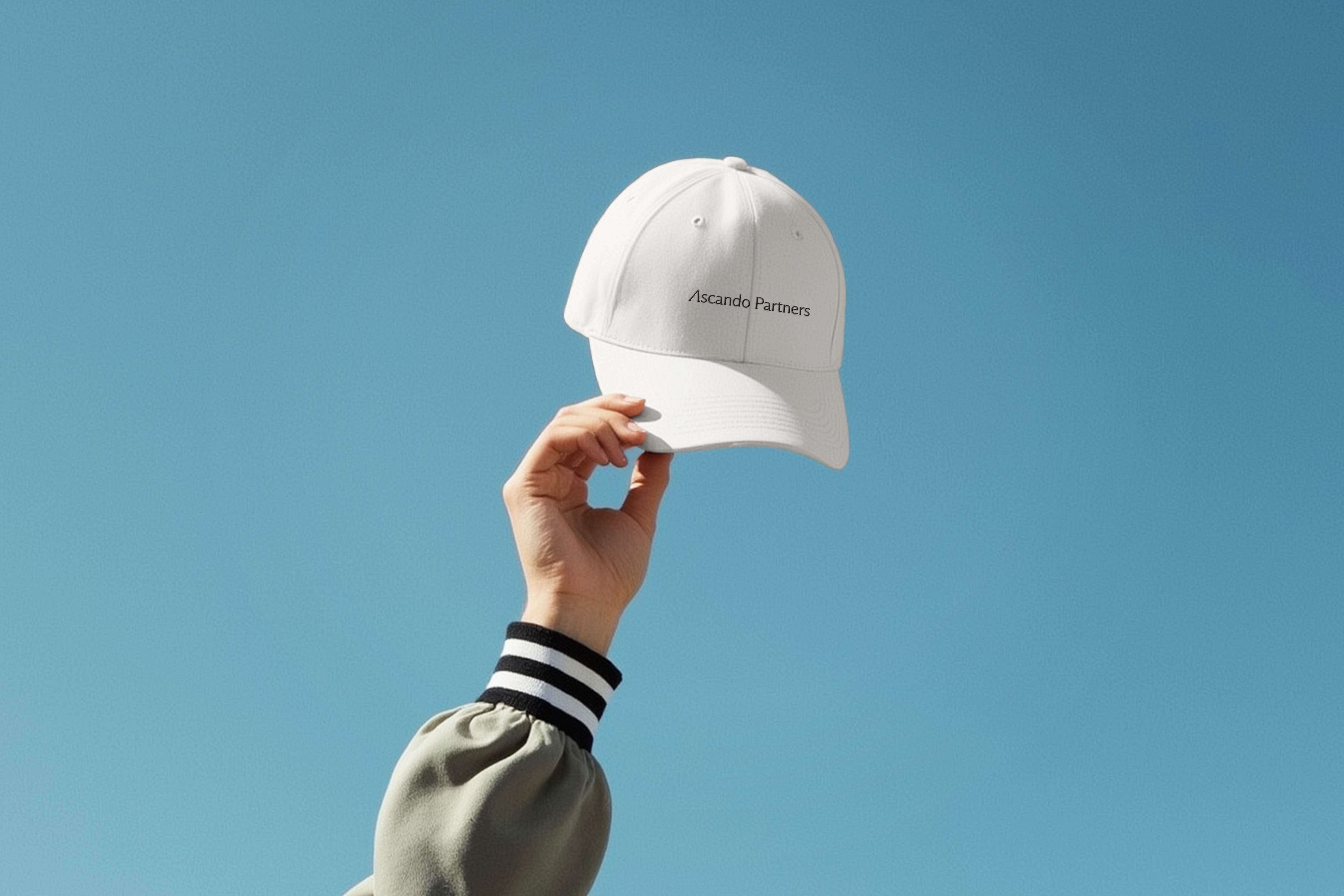
- Stationery and merchandise
- LinkedIn banners and launch carousel
- Website design and development in Webflow
Technology
Webflow with custom components and CMS for content. Licensed fonts from Dinamo. Brand manual built as separate pages in the same Webflow project.