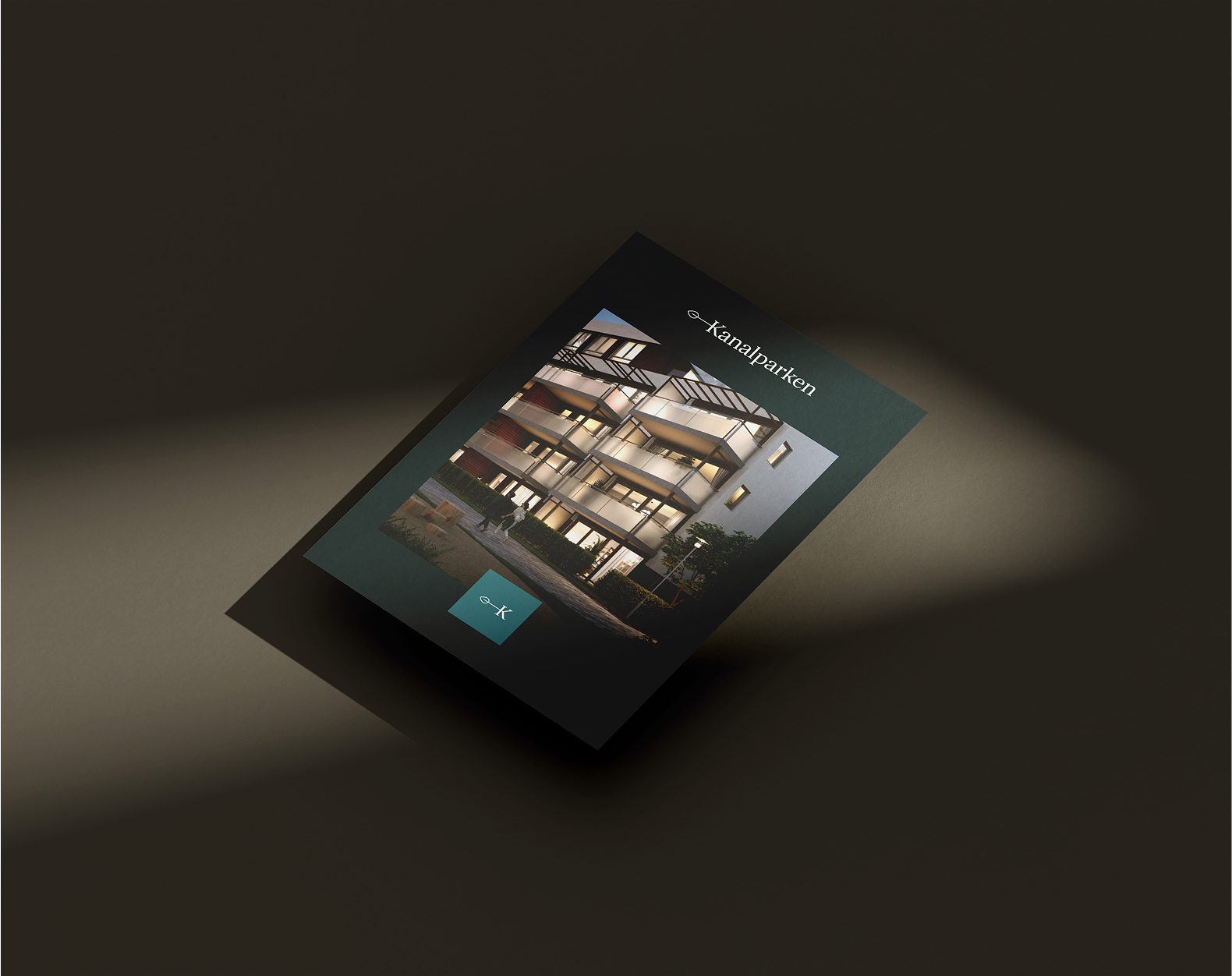
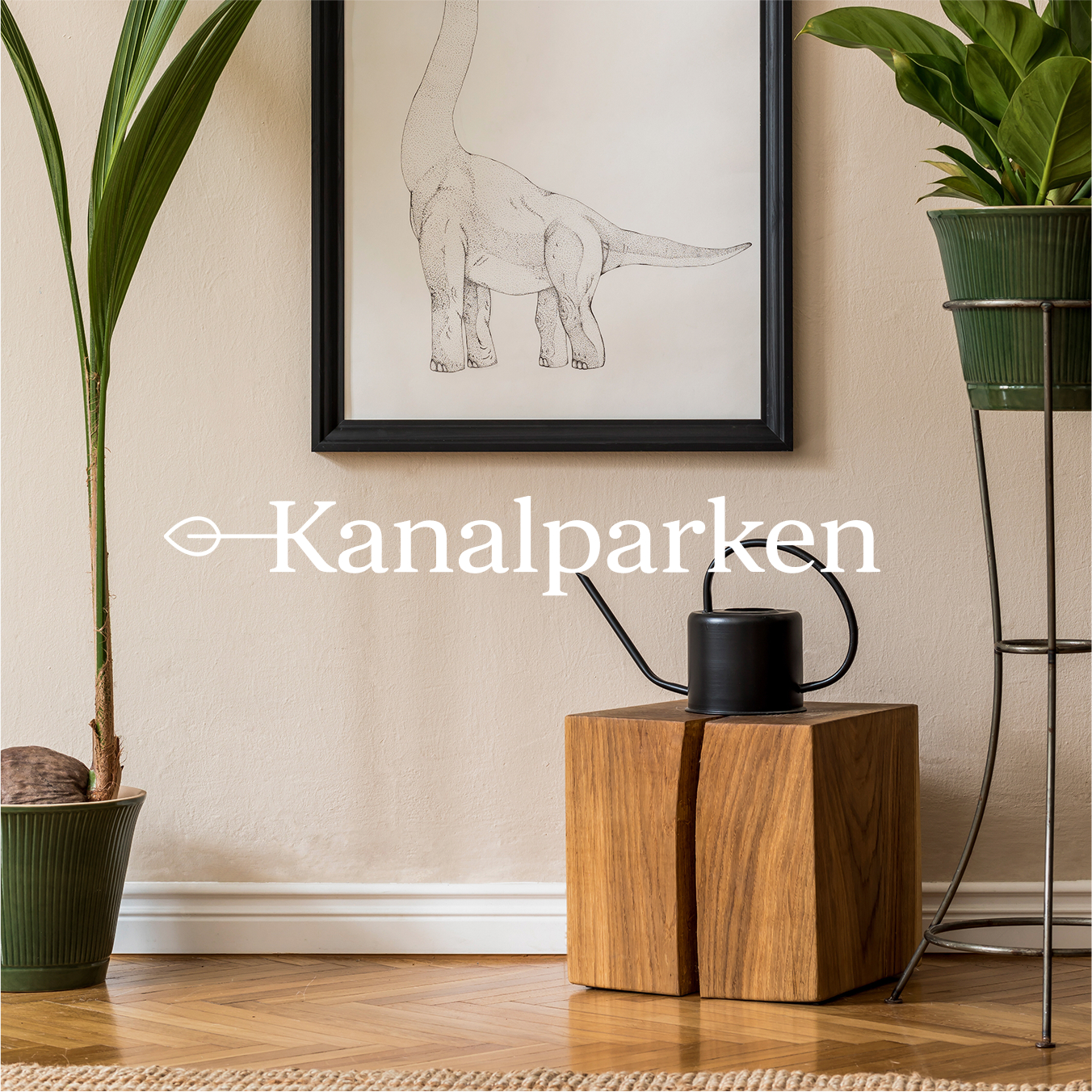
Kanalparken
By developing a unique and nature-inspired brand identity, we strengthened Kanalparken's position as an attractive and harmonious residential project.
- Kanalparken
- Kanalparken
- Kanalparken
- Kanalparken
- Kanalparken
- Kanalparken
- Kanalparken
- Kanalparken
- Kanalparken
- Kanalparken
- Kanalparken
- Kanalparken
- Kanalparken
- Kanalparken
- Kanalparken
- Kanalparken
- Kanalparken
- Kanalparken
- Kanalparken

Harmonious housing project with nature in focus
Task
Barlindhaug Eiendom wanted to develop a solid and accomplished brand identity for Kanalparken, a new housing project consisting of five apartment buildings. Based on the nearby water canal, they wanted both a well-thought-out name profile for the buildings and a comprehensive branding manual that could simplify and clarify communication towards the target audience.
Solution
We developed a logo that visually combines the shape of the canal with the natural elements of the park -- a minimalist line extending out of the letter “K”, finished with a single leaf. This symbolism reflects the location and natural values of the project. The color palette and visual elements were carefully chosen to appeal to the target audience's sense of harmony and connection to nature.
In close collaboration with the Barlindhaug Eiendom team, we developed five unique names for each building, inspired by different apple varieties. The idea is that each building can have its own apple tree planted nearby, giving residents the opportunity to enjoy the fruits in the summer. The typography, Orbicular, was specially chosen for the logo and headings to reinforce the brand's natural and harmonious expression.


Other projects

Skarsmoen
.jpg)
Barn til Bords
Ready to create something great?
Your brand deserves more than just visibility, it deserves results. Let's create impactful solutions that deliver real value.
Our clients trust us