Website design: how to build a fast, clean and selling website
Design is about choice. When the structure, language and speed play on teams, the website does its job. Here is the practical recipe we use on projects like Skarsmoen and Trolltunga.
- Website design: how to build a fast, clean and selling website
- Website design: how to build a fast, clean and selling website
- Website design: how to build a fast, clean and selling website
- Website design: how to build a fast, clean and selling website
- Website design: how to build a fast, clean and selling website
- Website design: how to build a fast, clean and selling website
- Website design: how to build a fast, clean and selling website
- Website design: how to build a fast, clean and selling website
- Website design: how to build a fast, clean and selling website
- Website design: how to build a fast, clean and selling website
- Website design: how to build a fast, clean and selling website
- Website design: how to build a fast, clean and selling website
- Website design: how to build a fast, clean and selling website
- Website design: how to build a fast, clean and selling website
- Website design: how to build a fast, clean and selling website
- Website design: how to build a fast, clean and selling website
- Website design: how to build a fast, clean and selling website
- Website design: how to build a fast, clean and selling website
- Website design: how to build a fast, clean and selling website
.jpg)
Introduction
Good website design doesn't start with colors or fonts. It starts by making it easy for the user to understand where they are, what they can get and what the next step is. The rest is noise. In 2025, those who prioritize structure, speed and clear messages win. We go through exactly how to set up information architecture, templates for pages that convert and the technical choices that make the page feel lightweight. The goal is not a pretty website. The goal is a website that moves people from curious to action.
.png)
Why structure beats decoration
The most brutal thing about website design is how much has to go away. A good page is like a good presentation. One idea per screen height. One primary action per section. We always start with a map of the user's top tasks and translate this into a simple information architecture. Menu and page hierarchy reflect real tasks, not the organization map. Once we set the structure, we write microcopy for buttons and headers before drawing the first frame in Figma. Then we avoid decorating ourselves away from the point.
Here's how to recognize a good structure:
You find what you came for without thinking.
The headlines can be read as a short story from top to bottom.
It is always clear what the next step is.
How to Build a Landing Page That Actually Sells
A landing page is a simplified negotiation. The user must understand the value, gain enough confidence to move forward and see a risk low enough to take action.
The order we use in practice
- Value + Primary Action
A phrase that says what you help with, for whom and why it is better. Not poetic. Just true and sharp. - Proof early
One sentence or a simple row of logos. A little case can be made here if you have results that are easy to understand. - How it works
Three short steps with small descriptions. The idea is to reduce uncertainty. - Benefits of Consequence
Write the effect for the user, not functions. - Social proof and details
Quote, numbers or a small module with reviews. - Prices or “how we work”
Provide enough transparency for people to dare to make contact. - FAQ
Three to five precise answers to the most common hurdles. - New CTA
Low threshold. “Book a 15-min chat” works better than “Contact us”.
The design system that holds everything together
The design should be invisible in use. We therefore set a lightweight design system early on. That means fixed typography levels, a handful of module types, fixed distances, and a single grid. When everything is predictable, the side feels calm and professional. This is also what makes production and further development fast. The Skarsmoen project is a good example. Clean typography, good air and images with real textures do the job. Identity carries the message, not the other way around.
Practical advice
- Color palette with few choices and good contrast.
- Button styles with distinct primary and secondary.
- Card modules that are repeated for rhythm.
- Components named equally in Figma and Webflow for low friction.
Speed is part of the design
A page that feels slow is perceived as poorly designed. We therefore plan performance from the first route. Great hero videos and heavy fonts are tempting. They destroy more than they help when they are not extremely well optimized. We aim for LCP under 2.5 seconds, preferably under 2 if possible. The images are exported in modern formats, we lazyload everything we can and remove scripts that do not provide direct value. Before publication, we run a round of performance, availability and SEO checks.
Minimum requirements in practice
- Fast server and CDN.
- Effective images and moderate animation.
- No heavy tracings in hero.
- Available focus states and alt texts on all images that add meaning.
Example from reality
When we built Trolltunga's new website, the goal was to make planning and security easy. The design is calm but resolute. Strong buttons, clear selections, good search function and clear routes for trip information. The result is a page that helps more people from inspiration to safe trip. Skarsmoen is about something else. Here, identity and product should carry the story. We tightened the typography and let the texture in the images do the work. Two different goals, same methodology.
.jpg)
Content used, not just read
The most underrated thing in website design is microcopy. A good button is often the difference between yes and no. Type buttons that describe the action with a verb. “See price and plan” converts better than “Read more”. Keep paragraphs short. One idea per episode. Use middle titles that can be skimmed. And let the pictures lift what the text says, not compete with it.
Final check before publication
Go one round without scrolling. Do you understand the value of two seconds. Go one round and skim only headers and buttons. Does that make sense. Go one round on mobile. Do you still feel in control. If the answer is yes three times, you can publish. Then everything is measured. Don't wait half a year. Adjust weekly for the first few weeks. Design is an ongoing process, not a finished product.
FAQ
What is the most common mistake we see in website design?
Too many choices. Too little prioritization. Pages where everything is going to be heavy to use.
Do we need a great brand manual to succeed?
The No. A lightweight design system and clear message beats a thick manual any day.
How often should we update the page?
Little and often. New sections, better formulations and smooth cleanup keep the page fresh and fast.
Do you want us to review the structure of your website and provide three concrete improvements at no cost. Get in touch and we'll send you a short video review.
Internal links:
simmer.no/en/projects/skarsmoen
simmer.no/en/projects/trolltunga
Other posts
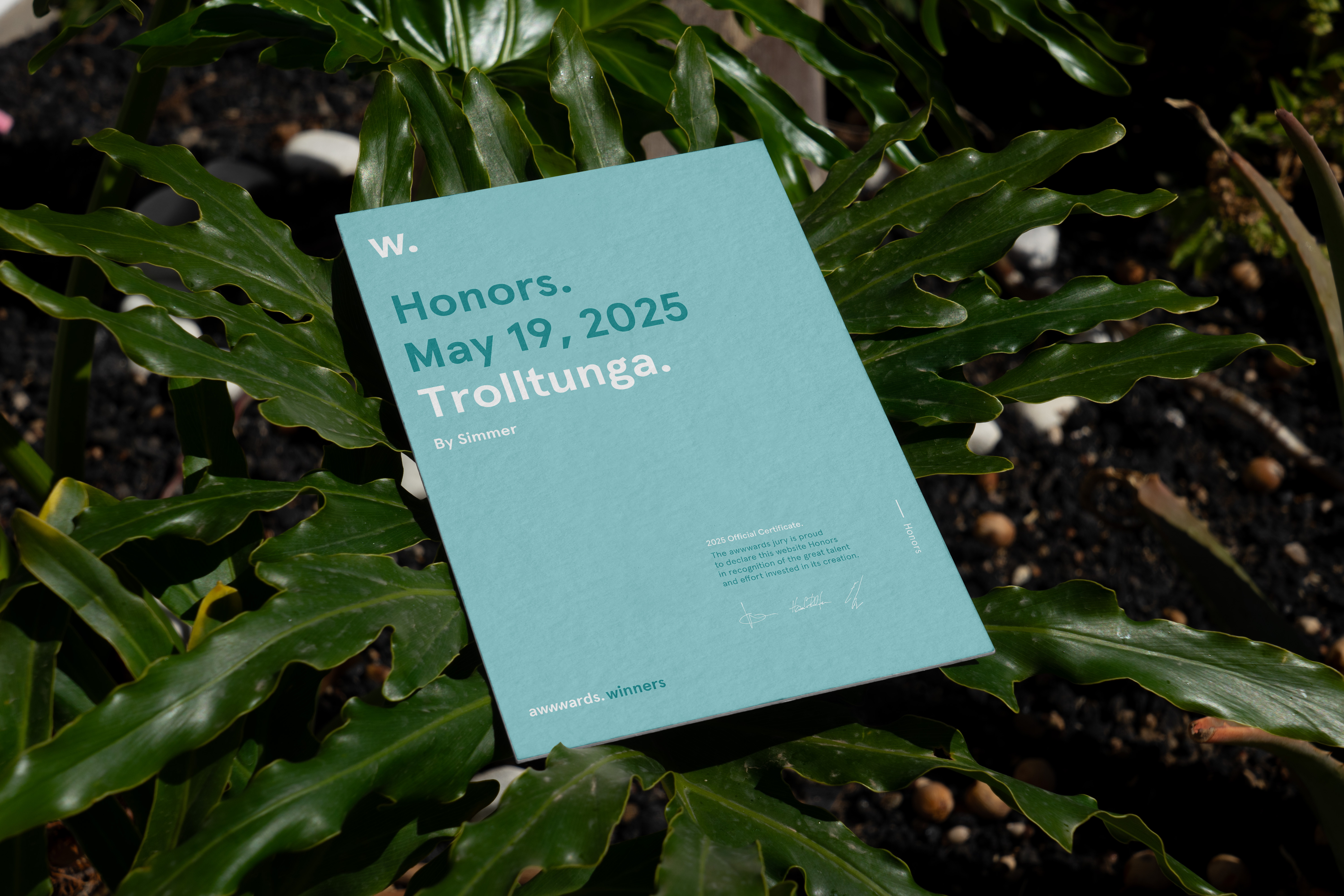
Honorable Mention at Awwwards for Trolltunga

New Simmer caps in house. Small thing, big joy.

Website design — Is it important and what characterizes good website design?
Ready to create something great?
Your brand deserves more than just visibility, it deserves results. Let's create impactful solutions that deliver real value.
Our clients trust us